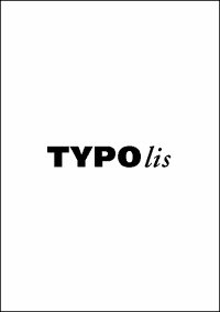
When is a text put exactly in the mid of a page?
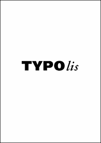
So we have here an optical illusion. In this example I pushed the text (nearly too much) higher. So it lies far above the mid. Nevertheless it seems to ly in the mid of the page.
Also in table-setting, in shaping visiting cards, even in other fields of design like photography it is relevant.