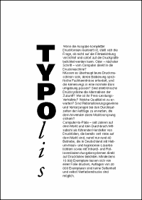
Vertical arrangement of letters one below the other is a typographically bad habit. The written text becomes badly legible and doesn't look very attractive.
|
shaping and design :
Crash course : Vertical arrangement of letters
|
|||||
|
|
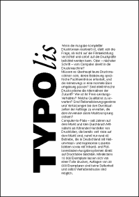
Vertical arrangement of letters one below the other is a typographically bad habit. The written text becomes badly legible and doesn't look very attractive. |
|
|||