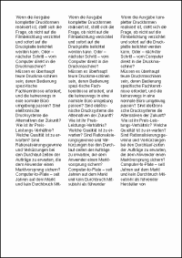
When the margins and so the type area for the text are fixed, there is the question how to put the text into this space.

The object is to avoid a »lead-desert« – this means a page that is badly legible and overloaded with text.
Divided up in more columns the text appears more elegant as if it runs all over the type area.
With type size, column broadth and page height standing in a reasonable relation, the text is catched by the eye very easily.
As well the columns mustn't be too cramped and not too broad.